# 插件数字输入组件(s-number-input)
针对国际业务,基于不同地区用户数字输入习惯差异新增对应数字输入框。
欧洲及部分地区会使用 “, ”作为小数点,用来区分小数和整数,同时使用点号 “.” 来分隔千位 点号 “.” 表示:许多英语国家,如美国、英国等,以及国际通用的科学计数法中,通常使用点号 “.” 作为小数点。例如,数字 “3.14” 表示 “三又百分之十四”。 逗号 “,” 表示:在一些欧洲大陆国家,如德国、法国、意大利等,习惯用逗号 “,” 来表示小数点。所以在这些国家,“3,14” 表示的就是我们通常理解的 “3.14”。在书写较大数字时,这些国家还会用点号 “.” 来分隔千位,例如 “1.000,00” 表示 “十万”。 特殊符号表示:在一些阿拉伯国家,会使用一个类似逗号但位置稍低的符号 “٫” 作为小数点。例如,“3٫14” 表示 “3.14”。
weex 组件, 页面 import 导入。
# 实例
# 基础用法
<template>
<scroller style="padding-left:32px;padding-right:32px;">
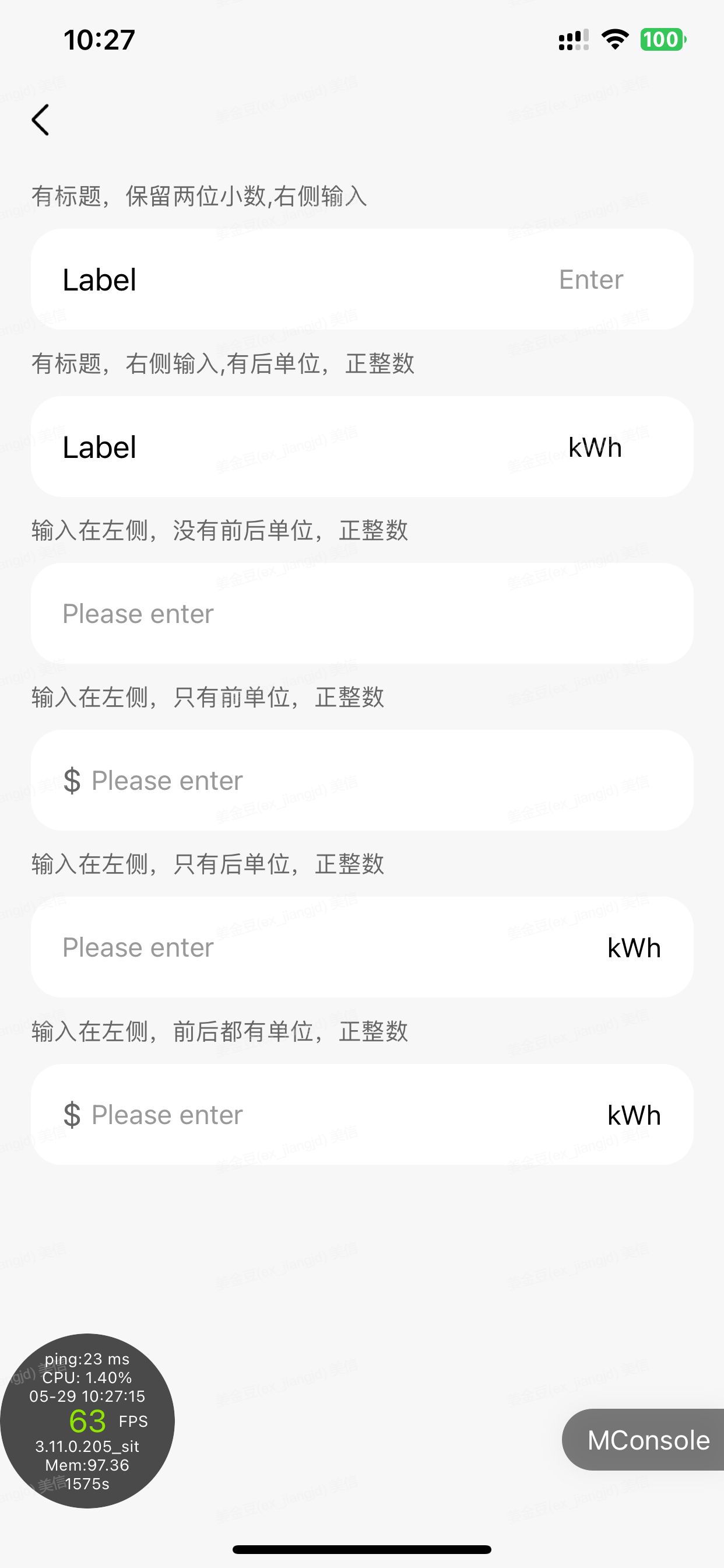
<text style="line-height:68px;width:750px;font-size:24px;color:#666;"
>有标题,保留1位小数,右侧输入</text
>
<s-number-input
placeholder="Enter"
v-model="inputValue"
:decimal-places="1"
@input="onInput"
ref='numberInput'
:formatNumberByAppDefault="true"
/>
<text style="line-height:68px;width:750px;font-size:24px;color:#666;"
>有标题,右侧输入,有前单位,保留2位小数</text
>
<s-number-input
placeholder="请输入金额"
v-model="amount"
:min="10"
:max="10000"
:decimal-places="2"
prefix-unit="¥"
@input="onInput2"
:formatNumberByAppDefault="false"
/>
<text style="line-height:68px;width:750px;font-size:24px;color:#666;"
>输入在左侧,没有前后单位,正整数</text
>
<s-number-input
:inputStyle="{ textAlign: 'left' }"
:decimal-places="0"
placeholder="Please enter"
/>
<text style="line-height:68px;width:750px;font-size:24px;color:#666;"
>输入在左侧,只有前单位,正整数</text
>
<s-number-input
:inputStyle="{ textAlign: 'left' }"
prefixUnit="$"
:decimal-places="0"
placeholder="Please enter"
/>
<text style="line-height:68px;width:750px;font-size:24px;color:#666;"
>输入在左侧,只有后单位,正整数</text
>
<s-number-input
:inputStyle="{ textAlign: 'left' }"
:decimal-places="0"
placeholder="Please enter"
postUnit="kWh"
/>
<text style="line-height:68px;width:750px;font-size:24px;color:#666;"
>输入在左侧,前后都有单位,正整数</text
>
<s-number-input
:inputStyle="{ textAlign: 'left' }"
:decimal-places="0"
placeholder="Please enter"
postUnit="kWh"
prefixUnit="$"
/>
</scroller>
</template>
<script>
// 引入组件库
import { SNumberInput } from "smarthome-weex-components";
export default {
components: {
SNumberInput,
},
data() {
return {
inputValue: "10230.8",
amount: 88.88,
};
},
computed: {
reverseFlag() {
if (this.lang === "ar" || this.lang === "he") {
return true;
}
return false;
},
},
methods: {
//输入框值变更就会触发
onInput(val) {
this.inputValue1 = val;
},
//输入框失去焦点才会触发change
onChange(val) {
this.inputValue1 = val;
},
onBlur() {},
onClear() {
this.$refs.numberInput.clear()
},
onFocus() {},
},
created() {
nativeService.getLanguage().then((res) => {
this.lang = res.language || "en";
});
},
mounted() {},
};
</script>
<style scoped></style>
# 默认功能
针对国际业务,基于不同地区用户数字输入习惯差异新增对应数字输入框。
1.s-number-input 组件是布局无关的, 它只包括了最基本的数字输入框部分,如果业务想为它增加边框、标题、或是一些操作按钮,可以配合其他组件使用。
2.当用户点击数字输入框,弹出操作系统的数字键盘
3.当用户手机默认是逗号为小数点时,唤起普通键盘(数字输入键盘无法输入逗号)
4.检测非法字符及非数字符号,自动替换
# Attributes
| Prop | Type | Required | Optional values(可选值) | Default | Description |
|---|---|---|---|---|---|
| v-model/value | string | NO | - | - | 输入框初始值 |
| placeholder | string | NO | - | - | 占位符文本 |
| returnKeyType | string | NO | defalut;go;next;search;send,done | done | 返回键类型 |
| postUnit | string | NO | - | - | 后单位 |
| prefixUnit | string | NO | - | - | 前单位 |
| reverse | Boolean | NO | - | false | 是否翻转适配阿拉伯语希伯来语 |
| customStyle | object | NO | - | - | 外框样式 |
| titleStyle | object | NO | - | - | 标题样式 |
| prefixUnitStyle | object | NO | - | - | 前单位样式 |
| inputStyle | object | NO | - | - | 输入框的样式 |
| decimalPlaces | number | NO | 0/1/2 | 0 | 小数位数限制 |
| min | number | NO | null | 最小值限制 | |
| max | number | NO | null | 最大值限制 | |
| hideDoneButton | Boolean | NO | true/false | false | 是否隐藏完成按钮(ios) |
| formatNumberByAppDefault | Boolean | NO | true/false | true | 是否用 APP 默认的小数点和分隔符(APP 默认是小数点,没有分隔符) |
| disabled | Boolean | NO | true/false | false | 是否禁止输入 |
| readonly | Boolean | NO | true/false | false | 是否只读 |
# Events
| 事件名称 | 说明 | 回调参数 |
|---|---|---|
| input | 输入框值变化时触发 | 当前值 |
| change | 输入框变化,失去焦点时才触发 | 当前值 |
| blur | 输入框失去焦点时触发 | 失去焦点后的值 |
| focus | 输入框获得焦点时触发 | - |