
# 7.5 遮罩弹窗(Mask)
起强调提示、警告作用,让用户确认与选择。
较特殊类型如运营推广、重要安全提示类弹窗可根据特殊场景需求设计样式;宽度原则上按规范270pt保持,高度可自适应。

# 应用示例
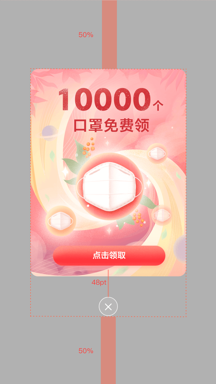
# dof-mask弹出层
弹层组件,可定制内容
# 实例
# 基础用法
<template>
  <div class="wrapper">
    <dof-minibar
      title="mask"
      background-color="#267AFF"
      text-color="#ffffff"
      :left-button="leftButton"
      @dofMinibarLeftButtonClicked="back"
      left-text="返回"
    ></dof-minibar>

   <div class="container">
      <dof-button
        class="btn"
        type="primary"
        text="打开mask"
        @dofButtonClicked="openMask">
      </dof-button>
   </div>

    <dof-mask height="700"
              width="540"
              duration="300"
              mask-bg-color="#FFFFFF"
              :has-overlay="true"
              :show-close="true"
              :show="show"
              border-radius="26"
              @dofMaskSetHidden="dofMaskSetHidden">
        <div class="content">
          <dof-image :src="activityImg"
                      resize="stretch"
                      @click="imgClick"
                      class="activityImg"></dof-image>
        </div>
      </dof-mask>
  </div>
</template>

<style scoped>
 .wrapper {
   background-color: #f2f2f2;
  }

  .container {
    justify-content: center;
    align-items: center;
  }
  .btn{
    margin:40px auto;
  }

  .content{
    width: 540px;
    height: 700px;
    border-radius: 26px;
    overflow: hidden;
  }

  .activityImg{
    width: 540px;
    height: 700px;
  }
</style>

<script>
import { DofButton, DofMinibar, DofMask, DofImage } from 'dolphin-intl-ui'
const modal = weex.requireModule('modal');

export default {
  components: { DofButton, DofMinibar, DofMask ,DofImage},
  data() {
    return {
      leftButton: 'assets/img/header/TB1cAYsbv2H8KJjy0FcXXaDlFXa-30-53.png',
      show: false,
      activityImg:'assets/img/image/activity.png'
    }
  },
  methods: {
     openMask (e) {
        this.show = true;
      },

      dofMaskSetHidden () {
        this.show = false;
         modal.toast({
          message: `您点击了close按钮`
        });
      },

      imgClick(){
        modal.toast({
          message: `您点击了图片按钮`
        });
      }
  }
}
</script>
1
2
3
4
5
6
7
8
9
10
11
12
13
14
15
16
17
18
19
20
21
22
23
24
25
26
27
28
29
30
31
32
33
34
35
36
37
38
39
40
41
42
43
44
45
46
47
48
49
50
51
52
53
54
55
56
57
58
59
60
61
62
63
64
65
66
67
68
69
70
71
72
73
74
75
76
77
78
79
80
81
82
83
84
85
86
87
88
89
90
91
92
93
94
95
96
97
98
2
3
4
5
6
7
8
9
10
11
12
13
14
15
16
17
18
19
20
21
22
23
24
25
26
27
28
29
30
31
32
33
34
35
36
37
38
39
40
41
42
43
44
45
46
47
48
49
50
51
52
53
54
55
56
57
58
59
60
61
62
63
64
65
66
67
68
69
70
71
72
73
74
75
76
77
78
79
80
81
82
83
84
85
86
87
88
89
90
91
92
93
94
95
96
97
98
# Attributes
| Prop | Type | Required | Default | Description |
|---|---|---|---|---|
| show | Bool | N | false | 是否显示 |
| width | String | Number | N | 540 | 面板的宽度 |
| height | String | Number | N | 800 | 面板的高度 |
| top | Number | N | 0 | 面板的 top 值,为 0 时垂直居中面板 |
| border-radius | String / Number | N | 32 | 弹出层的 border-radius |
| duration | String | Number | N | 300 | 弹层出现过渡时间 |
| show-close | Bool | N | true | 是否显示下面的关闭按钮 |
| has-overlay | Bool | N | true | 是否有蒙层 |
| mask-bg-color | String | N | transparent | mask 的背景颜色 |
has-animation | Boolean | N | true | 是否有动画效果 |
timing-function | Array | N | ['ease-in', 'ease-out'] | 动画时序函数 |
overlay-cfg | Object | N | {"hasAnimation":true,"timingFunction":["cubic-bezier(0.25, 0.1, 0.25, 1.0)","cubic-bezier(0.25, 0.1, 0.25, 1.0)"],"canAutoClose":false,"duration":300,"opacity":0.3} | 遮罩层配置(支持 hasAnimation, timingFunction, canAutoClose, duration, opacity) |
opacity | Number / String | N | 0.3 | 遮罩层透明度 |
screen-width | Number | N | 750 | 屏幕宽度(用于适配) |
need-dark-mode | Boolean | N | false | 是否启用 M-dark/T-dark 内置暗黑适配 |
设置 :need-dark-mode="true" 可启用内置暗黑配色,主题初始化与构建配置见 接入说明。
向内部 Overlay 透传暗黑开关;外层透明背景保留。
# Slot
<slot></slot>:mask匿名插槽,可直接在mask标签内直接使用,替换默认 slot 占位
# Events
| 事件名 | 说明 | 回调参数 |
|---|---|---|
dofMaskSetHidden | - | {} |